I started noticing a quiet pattern in cafes and hospital waiting rooms and at grassroots football matches: when people were doing the hard work of getting on with life they seemed to reach, almost habitually, for a small set of colours. Not the garish seasonal palette of Instagram but particular tones that functioned like daily tools. This is not decorative superstition. Psychology gives us a language to read those choices and to understand how colour acts as a companion in endurance.
The palette that keeps people going
If you pay attention you will see it: navy jackets on people dealing with difficult conversations. A shot of scarlet on a desk where decisions have to be made. A sprig of moss green in a flat where someone is rebuilding after a setback. These are not fashion statements alone. They are choices that shape attention and emotion in small, repeated acts. I believe resilient people use colour the way some people use ritual: not always consciously, but reliably.
Blue as an anchor for thought
Blue works the way a steady hand does. It does not demand. It offers cognitive space. In lab settings and everyday observations the shade of blue people pick tends to calm the pace of thought and lower physiological agitation. For someone enduring a slow grinding difficulty blue rarely erases anxiety; it makes thinking possible while anxiety remains. That quality is underrated because it is not dramatic. Resilience is often about preserving the machinery of action rather than producing grand epiphanies, and blue helps keep that machinery well oiled.
Red as selective ignition
Red is a different instrument. Where blue buys time and precision, red triggers. Not all resilient people bathe themselves in red. Rather, they use red in small doses when they need to flip from rumination into doing. A red pen to sign an agreement. A scarlet cue card to begin a performance. Red narrows the aperture of attention and makes some forms of risk feel reachable. The trick is microdosing. Too much red becomes noise; a little red can be an engine.
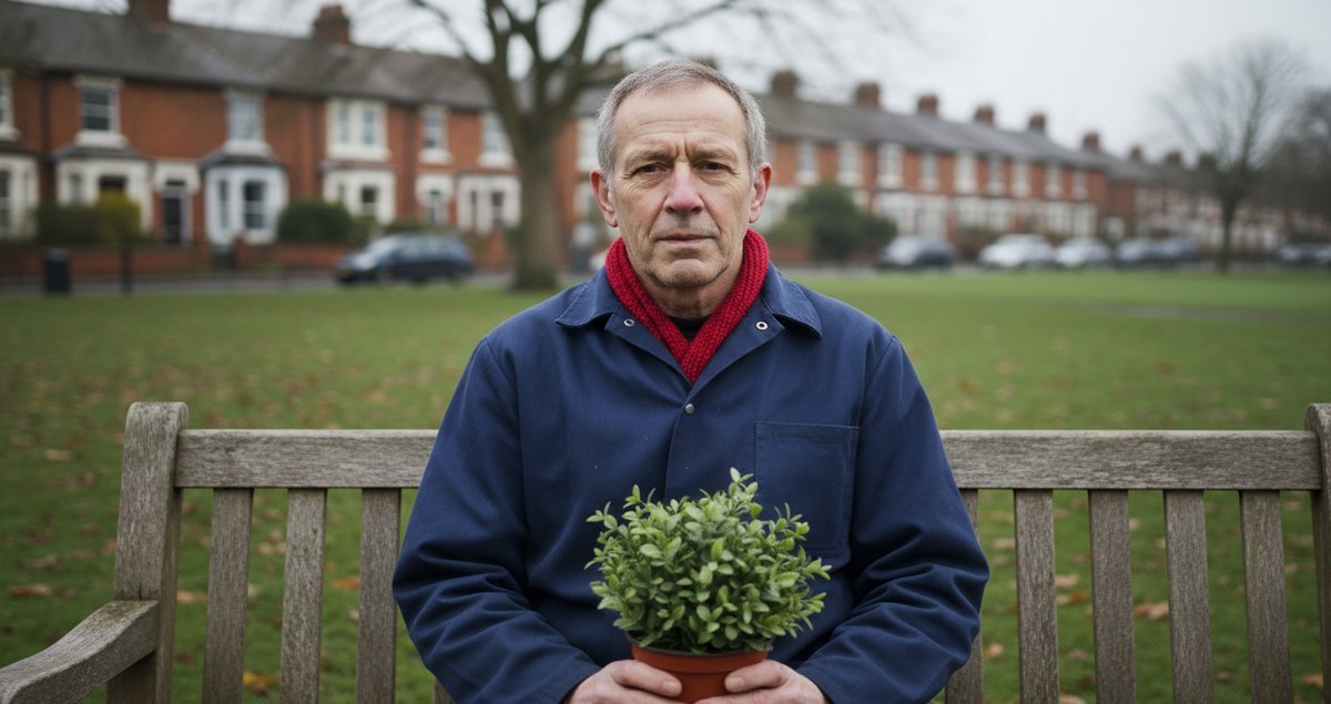
Green as restoration and quiet confidence
Green shows up in the places where repair happens. Plants, landscapes, even a green notebook. The connection between green and recovery has a thick evidence base in environmental psychology. For people who must recover repeatedly green becomes a practical ally. It does not rush. It invites a kind of patient re-engagement with tasks and feelings. If resilience is a return trajectory then green maps those slow arcs.
People like colors to the degree that they like the objects that are strongly associated with those colors. – Stephen E. Palmer Professor of Psychology University of California Berkeley.
Palmer and colleagues formalised an idea that I find useful because it refuses mystical claims and insists on lived associations. Colour preference is not isolated; it is entangled with experience. Your blue may be my blue because that blue belongs to a sea you love. That linkage explains why resilient people from different cultures might still pick similar tones if the objects they rely on share qualities.
Why this matters beyond interior design
Talk of colours can sound trivial until you notice what they do to decision rhythms. Designers and managers who ignore the emotional affordances of colour lose an easy lever. But equally it is a poor reduction to say colour alone makes people resilient. Colour is a small amplifier. It nudges attention, modulates stress responses, and scaffolds memory. Combined with habit and environment it becomes a reliable cue: this place is for work, this colour means go, this corner is where I repair.
Colours as public private signals
There is a social dimension. Choosing certain colours in public settings communicates an orientation without words. A navy coat in a courtroom or at a union meeting signals steadiness more effectively than any statement you will make in the first five minutes. These are not deliberate performances in most cases; rather small, repeated signals that accumulate trust and predictability around a person. Resilient people tend to prefer colours that lower the frictions between intent and action.
Where the theory hits limits
Not every resilient person reaches for blue green and red. People carry idiosyncratic histories. Cultural meanings twist tones. Ecological valence theory explains a lot but not all. There are textures and patterns and scent pairings that alter how a colour functions. There are also moments where a colour betrays its usual role: a blue room that becomes cold and isolating rather than calming, or a green that feels twee rather than restorative. Context matters.
Practical, selfish, and humane uses
If you want to test this on yourself do something slightly foolish: pick one small daily object in a colour that fits the role you need. Choose a cobalt mug for patience. Choose a small crimson notebook for tasks that require will. Choose a plant or a green bedside lamp for nights when you must wake and go on. These are tiny experiments in altering attention and habit. They will not transform trauma but they might change the angle of your next day.
Unexpected insights I keep coming back to
First, resilience is a collage of tiny environmental choices as much as it is temperament. Second, colour preference is often post hoc rationalised; people invent stories about why a shade helps them when the truth is more mundane: it simply linked to something they liked. Third, the colours people reach for in public are often the ones they avoid at home. Private contexts permit other palettes. That split matters because it shows resilience is negotiated differently across surfaces of life.
I am not claiming a deterministic rule. I am arguing for attention. Colour is a cheap intervention and a portable language. You can change it faster than you can change a job or a relationship. That alone makes it worth noticing.
Summary
At root resilient people favour colours that help them think act and recover. Blue slows and steadies. Red narrows and energises. Green repairs and renews. The preference is rarely conscious and often tied to positive associations with objects and places. Use colour as a small practical tool not a cure.
Summary Table
| Colour | Typical Role | How resilient people use it |
|---|---|---|
| Blue | Anchor for thought | Backgrounds clothing and objects that create calm cognitive space |
| Red | Motivation spark | Small cues and accents to trigger action or focus |
| Green | Restoration | Plants and natural tones for recovery and gradual reengagement |
FAQ
Do people in different cultures prefer different resilience colours?
Yes and no. The broad roles of calm energy and restoration show up across many cultures because they respond to shared cognitive and physiological processes. But the specific shade that reads as calming or energising can vary depending on local environments and object associations. For instance coastal populations with long histories of sea related livelihoods may privilege certain blues differently than inland communities whose positive associations gather around fields and trees. That is ecological valence theory at work: preference follows meaningful experience.
Can changing the colours around me make me more resilient overnight?
No. Colour is not a magic fix. It is an amplifier and a cue. If you alter your environment with thought you may find small changes in attention and mood but these accumulate slowly. The value of colour lies in repetition and context. Use it as a steadying companion rather than a quick fix.
Should I redecorate my workspace if I want to be more resilient?
Only if you want to. Start smaller. Swap a mouse mat or a notebook for a colour that supports the function you need most. Observe. If it changes your behaviour or mood keep going. The goal is practical durability not aesthetic perfection. Resist trend driven overhauls that speak to others more than to your needs.
Are there colours resilient people avoid?
Often people who practice endurance avoid visual noise and excessively bright or clashing palettes that create cognitive friction. Very muddy browns and dirty yellows frequently carry negative associations because they are linked to unpleasant objects in many environments. But avoidance is personal; it is as much about past associations as about universal rules.
What research should I read if I want deeper grounding?
Start with ecological valence theory literature by Stephen Palmer and Karen Schloss and then look to the Handbook of Color Psychology for broader reviews. These works explain both experimental evidence and the limits of broad claims about universal meanings. They are measured and reasssuring for anyone suspicious of colour fluff pieces.